# code for loading the format for the notebook
import os

# path : store the current path to convert back to it later
path = os.getcwd()
os.chdir(os.path.join('..', '..', 'notebook_format'))

from formats import load_style
load_style(css_style = 'custom2.css', plot_style = False)
os.chdir(path)

# 1. magic for inline plot
# 2. magic to print version
# 3. magic so that the notebook will reload external python modules
# 4. magic to enable retina (high resolution) plots
# https://gist.github.com/minrk/3301035
%matplotlib inline
%load_ext watermark
%load_ext autoreload
%autoreload 2
%config InlineBackend.figure_format = 'retina'

import numpy as np
import pandas as pd
import matplotlib.pyplot as plt
from pathlib import Path
from sklearn.ensemble import RandomForestClassifier
from sklearn.model_selection import train_test_split

%watermark -a 'Ethen' -d -t -v -p numpy,pandas,matplotlib,sklearn
Partial Dependence Plot
During the talk, Youtube: PyData - Random Forests Best Practices for the Business World, one of the best practices that the speaker mentioned when using tree-based models is to check for directional relationships. When using non-linear machine learning algorithms, such as popular tree-based models random forest and gradient boosted trees, it can be hard to understand the relations between predictors and model outcome as they do not give us handy coefficients like linear-based models. For example, in terms of random forest, all we get is the feature importance. Although based on that information, we can tell which feature is significantly influencing the outcome based on the importance calculation, it does not inform us in which direction is the predictor influencing outcome. In this notebook, we'll be exploring Partial dependence plot (PDP), a model agnostic technique that gives us an approximate directional influence for a given feature that was used in the model. Note much of the explanation is "borrowed" from the blog post at the following link, Blog: Introducing PDPbox, this documentation aims to improve upon it by giving a cleaner implementation.
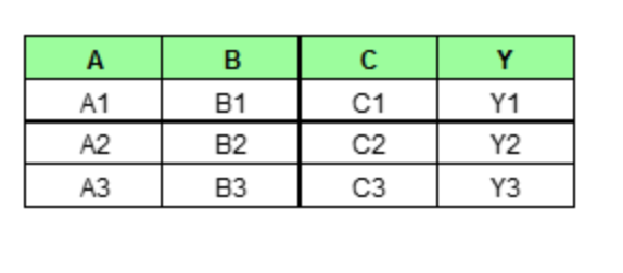
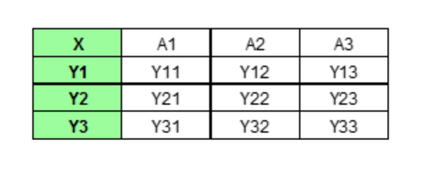
Partial dependence plot (PDP) aims to visualize the marginal effect of a given predictor towards the model outcome by plotting out the average model outcome in terms of different values of the predictor. Let's first gain some intuition of how it works with a made up example. Assume we have a data set that only contains three data points and three features (A, B, C) as shown below.
If we wish to see how feature A is influencing the prediction Y, what PDP does is to generate a new data set as follow. (here we assume that feature A only has three unique values: A1, A2, A3)
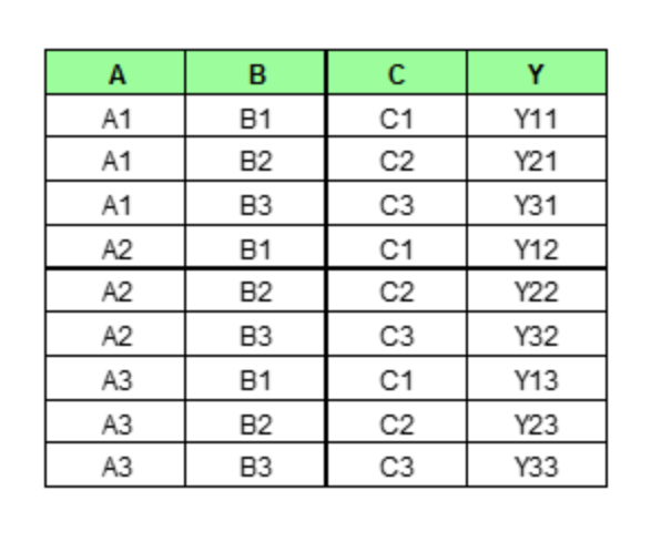
We then perform the prediction as usual with this new set of data. As we can imagine, PDP would generate num_rows * num_grid_points (here, the number of grid point equals the number of unique values of the target feature, more on this later) number of predictions and average them for each unique value of Feature A.
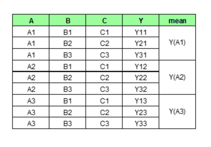
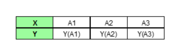
In the end, PDP would only plot out the average predictions for each unique value of our target feature.
Let's now formalize this idea with some notation. The partial dependence function is defined as:
$$ \begin{align} \hat{f}_{x_S}(x_S) = E_{x_C} \left[ f(x_S, x_C) \right] \end{align} $$The term $x_S$ denotes the set of features for which the partial dependence function should be plotting and $x_C$ are all other features that were used in the machine learning model $f$. In other words, if there were $p$ predictors, $S$ is a subset of our $p$ predictors, $S \subset \left\{ x_1, x_2, \ldots, x_p \right\}$, $C$ would be complementing $S$ such that $S \cup C = \left\{x_1, x_2, \ldots, x_p\right\}$. The function above is then estimated by calculating averages in the training data, which is also known as Monte Carlo method:
$$ \begin{align} \hat{f}_{x_S}(x_S) = \frac{1}{n} \sum_{i=1}^n f(x_S, x_{Ci}) \end{align} $$Where $\left\{x_{C1}, x_{C2}, \ldots, x_{CN}\right\}$ are the values of $X_C$ occurring over all observations in the training data. In other words, in order to calculate the partial dependence of a given variable (or variables), the entire training set must be utilized for every set of joint values. For classification, where the machine learning model outputs probabilities, the partial dependence function displays the probability for a certain class given different values for features $x_s$, a straightforward way to handle multi-class problems is to plot one line per class.
Individual Conditional Expectation (ICE) Plot
As an extension of a PDP, ICE plot visualizes the relationship between a feature and the predicted responses for each observation. While a PDP visualizes the averaged relationship between features and predicted responses, a set of ICE plots disaggregates the averaged information and visualizes an individual dependence for each observation. Hence, instead of only plotting out the average predictions, ICEbox displays all individual lines. (three lines in total in this case)
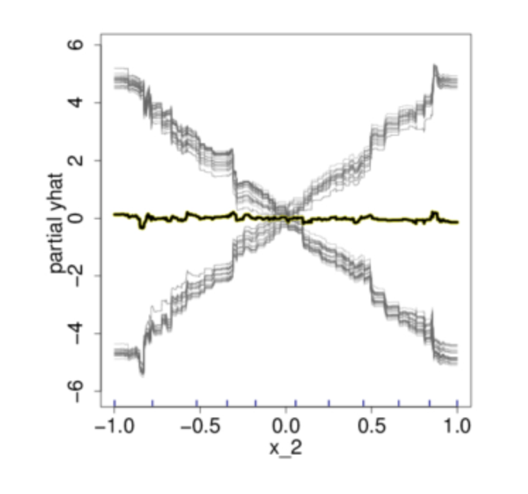
The authors of the Paper: A. Goldstein, A. Kapelner, J. Bleich, E. Pitkin Peeking Inside the Black Box: Visualizing Statistical Learning with Plots of Individual Conditional Expectation claims with everything displayed in its raw state, any interesting discovers wouldn’t be shielded because of the averaging inherented with PDP. A vivid example from the paper is shown below:
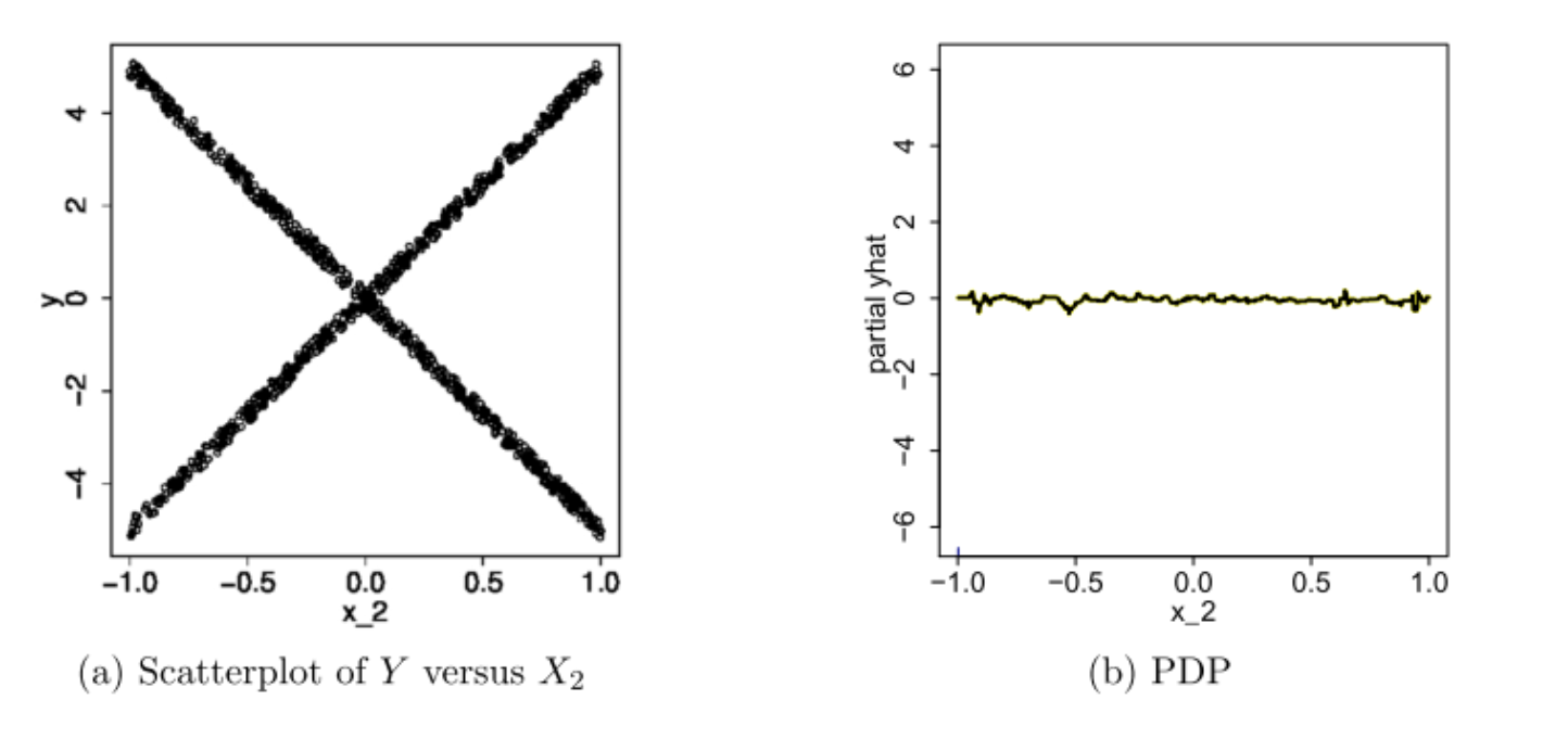
In this example, if we only look at the PDP in Figure b, we would think that on average, the feature X2 is not meaningfully associated with the our target response variable Y. However, if judging from the scatter plot showed in Figure a, this conclusion is plainly wrong. Now if we were to plot out the individual estimated conditional expectation curves, everything becomes more obvious.
After having an understand of the procedure for PDP and ICE plot, we can observe that:
- PDP is a global method, it takes into account all instances and makes a statement about the global relationship of a feature with the predicted outcome.
- One of the main advantage of PDP is that it can be used to interpret the result of any "black box" learning methods.
- PDP can be quite computationally expensive when the data set becomes large.
- Owing to the limitations of computer graphics, and human perception, the size of the subsets $x_S$ must be small (l ≈ 1,2,3). There are of course a large number of such subsets, but only those chosen from among the usually much smaller set of highly relevant predictors are likely to be informative.
- PDP can obfuscate relationship that comes from interactions. PDPs show us how the average relationship between feature $x_S$ and $\hat{y}$ looks like. This works well only in cases where the interactions between $x_S$ and the remaining features $x_C$ are weak. In cases where interactions do exist, the ICE plot may give a lot more insight of the underlying relationship.
Implementation
We'll be using the titanic dataset (details of the dataset is listed in the link) to test our implementation.
# we download the training data and store it
# under the `data` directory
data_dir = Path('data')
data_path = data_dir / 'train.csv'
data = pd.read_csv(data_path)
print('dimension: ', data.shape)
print('features: ', data.columns)
data.head()
# some naive feature engineering
data['Age'] = data['Age'].fillna(data['Age'].median())
data['Embarked'] = data['Embarked'].fillna('S')
data['Sex'] = data['Sex'].apply(lambda x: 1 if x == 'male' else 0)
data = pd.get_dummies(data, columns = ['Embarked'])

# features/columns that are used
label = data['Survived']
features = [
    'Pclass', 'Sex',
    'Age', 'SibSp',
    'Parch', 'Fare',
    'Embarked_C', 'Embarked_Q', 'Embarked_S']
data = data[features]

X_train, X_test, y_train, y_test = train_test_split(
    data, label, test_size = 0.2, random_state = 1234, stratify = label)
# fit a baseline random forest model and show its top 2 most important features
rf = RandomForestClassifier(n_estimators = 50, random_state = 1234)
rf.fit(X_train, y_train)

print('top 2 important features:')
imp_index = np.argsort(rf.feature_importances_)
print(features[imp_index[-1]])
print(features[imp_index[-2]])
Aforementioned, tree-based models lists out the top important features, but it is not clear whether they have a positive or negative impact on the result. This is where tools such as partial dependence plots can aid us communicate the results better to others.
from partial_dependence import PartialDependenceExplainer
plt.rcParams['figure.figsize'] = 16, 9


# we specify the feature name and its type to fit the partial dependence
# result, after fitting the result, we can call .plot to visualize it
# since this is a binary classification model, when we call the plot
# method, we tell it which class are we targeting, in this case 1 means
# the passenger did indeed survive (more on centered argument later)
pd_explainer = PartialDependenceExplainer(estimator = rf, verbose = 0)
pd_explainer.fit(data, feature_name = 'Sex', feature_type = 'cat')
pd_explainer.plot(centered = False, target_class = 1)
plt.show()

Hopefully, we can agree that the partial dependence plot makes intuitive sense, as for the categorical feature Sex, 1 indicates that the passenger was a male. And we know that during the titanic accident, the majority of the survivors were female passenger, thus the plot is telling us male passengers will on average have around 40% chance lower of surviving when compared with female passengers. Also instead of only plotting the "partial dependence" plot, the plot also fills between the standard deviation range. This is essentially borrowing the idea from ICE plot that only plotting the average may obfuscate the relationship.
Centered plot can be useful when we are not interested in seeing the absolute change of a predicted value, but rather the difference in prediction compared to a fixed point of the feature range.
# centered = True is actually the default
pd_explainer.plot(centered = True, target_class = 1)
plt.show()

We can perform the same process for numerical features such as Fare. We know that more people from the upper class survived, and people from the upper class generally have to pay more Fare to get onboard the titanic. The partial dependence plot below also depicts this trend.
pd_explainer.fit(data, feature_name = 'Fare', feature_type = 'num')
pd_explainer.plot(target_class = 1)
plt.show()

If you prefer to create your own visualization, you can call the results_ attribute to access the partial dependence result. And for those that are interested in the implementation details, the code can be obtained at the following link.
We'll conclude our discussion on parital dependence plot by providing a link to another blog that showcases this method's usefulness in ensuring the behavior of the new machine learning model does intuitively and logically match our intuition and does not differ significantly from a baseline model. Blog: Using Partial Dependence to Compare Sort Algorithms